UX/UI project of existing interface

BOOKING.COM

This project aimed to improve Booking.com desktop website to improve their user interface from an usability perspective.
Time – 2022 nov → 2022 dec
Team – 5 people
Role – UX/UI Designer
Programs –

Figma

Background

In today’s world, digitalization is more appreciated and integrated into daily life than ever before. Booking.com stands out as a world-leading travel agency where all communication is digital, perfectly catering to modern users who prefer interacting with a digital travel guide over a physical one.

Founded in Amsterdam in 1996, Booking.com now operates in 43 countries and offers over 28 million bookable options, including accommodations, flights, car rentals, attractions, and airport taxis.

Aim

The purpose of this project was to evaluate and redesign the Booking.com website from a usability perspective. This is a website where users can book accommodations and flights. The project was limited to features related to finding and booking accommodations on the website. The main task examined in this project was booking accommodations from the Booking homepage to the checkout page. The goal of the redesign was to enable an interface with high usability and user experience which makes it easy, efficient and satisfactorily for the user.
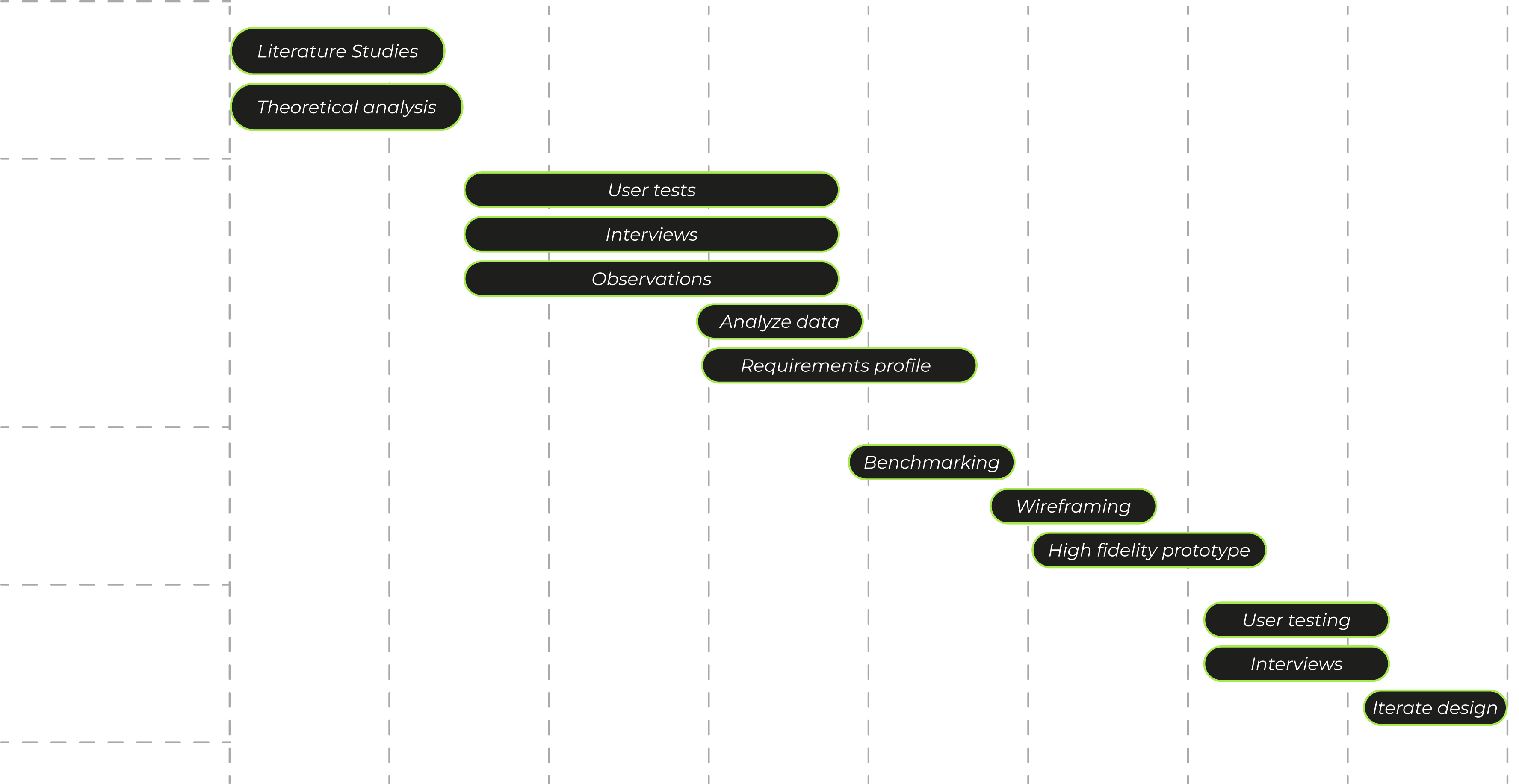
Scope of Work

Process

Theoretical evaluation

The theoretical evaluation was conducted by first exploring the website and then using evaluation methods such as Hierarchical Task Analysis (HTA), Cognitive Walkthrough (CW), and Predictive Human Error Analysis (PHEA). Additionally, a target audience was defined, and a semantic analysis of desired semantic impressions was performed.

A theoretical color analysis was also conducted to ensure that branding and desired customer impressions were maintained. This included a literature review and analysis of the website.

Ethnographic studies

To achieve a deeper analysis of the interface and its users we resorted to ethnographic studies were they were asked to complete pre defined tasks and answer questions about their experience. In order to achieve as qualitative result as possible we aimed at study a diverse demographic of people.

Gender

Experience

Age

User test 1

In User Test 1, the original website was evaluated for semantics, guessability, effectiveness, efficiency, and satisfaction. Participants’ actions, task times, and errors were recorded, and user experience questions were asked. The test subjects was also asked to grade their experience with semantic scales. The tests were conducted in various environments and on different devices, both remotely and on-site. All tests were recorded via Zoom, capturing screen activity and usually audio and video of participants.

Task 1

Guessability, Effectiveness & Efficiency.
Book a room for 2 adults in Amsterdam from January 3rd to 5th. Proceed to choose accommodation from multiple options, explore it, select a room for two people, and proceed to checkout to “book accommodation.” They are provided with fake name and details to fill in.

Task 2

Guessability, Effectiveness & Efficiency.
Book two separate rooms for 2 adults and 2 children in Milan from Friday to Sunday. The accommodations should include breakfast, a pool, double beds in all rooms, and a budget of up to 2000 per night. They proceed to checkout to “book accommodation,” providing fake name and details.

Task 3

Satisfaction
Finally, participants was asked questions about the website. These questions will focus on their experience with the booking process, how confident they felt in completing tasks, and feedback on what worked well and what didn’t.

Analysis

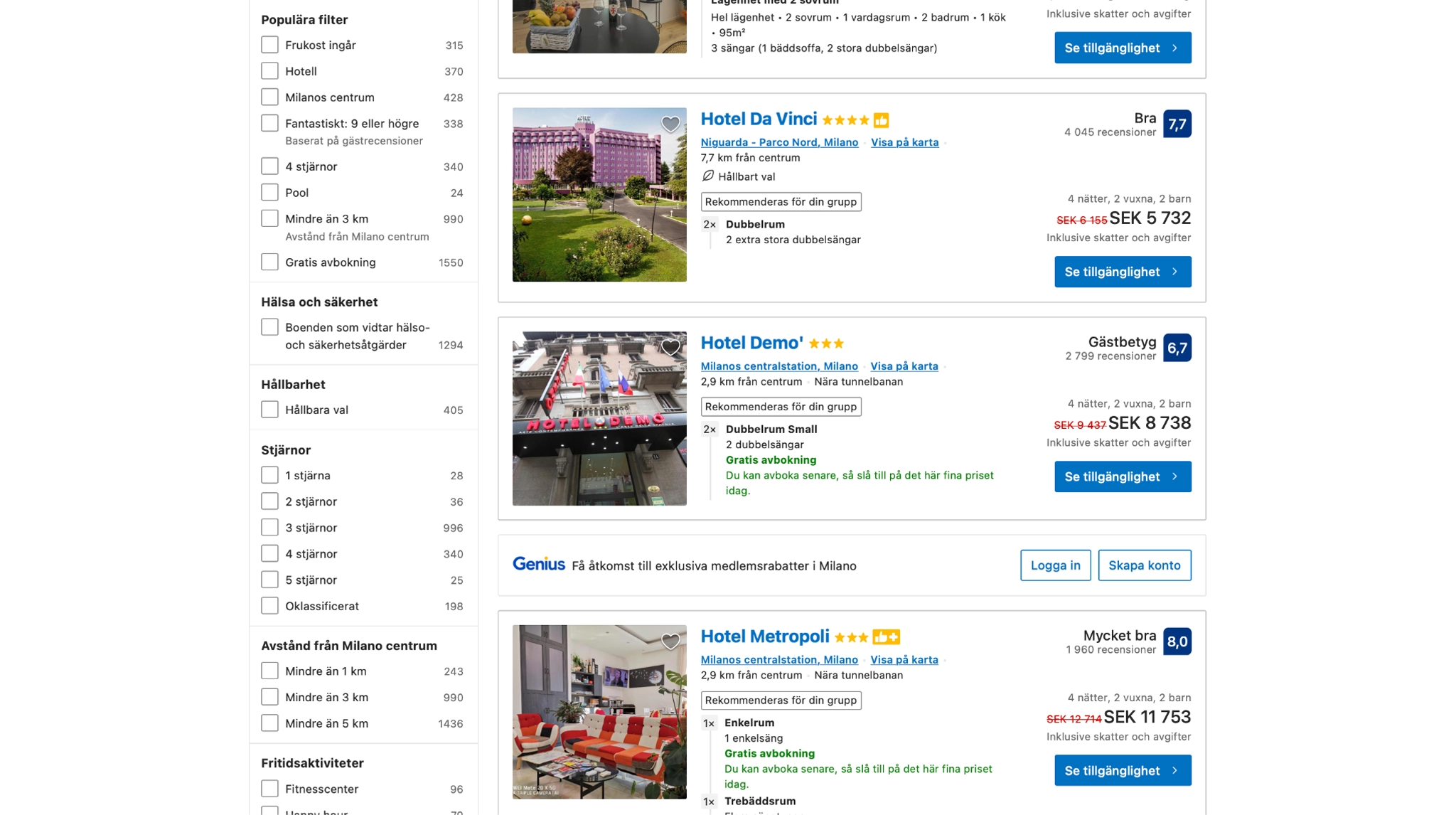
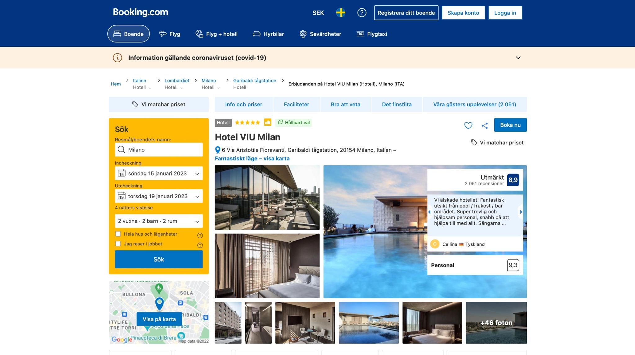
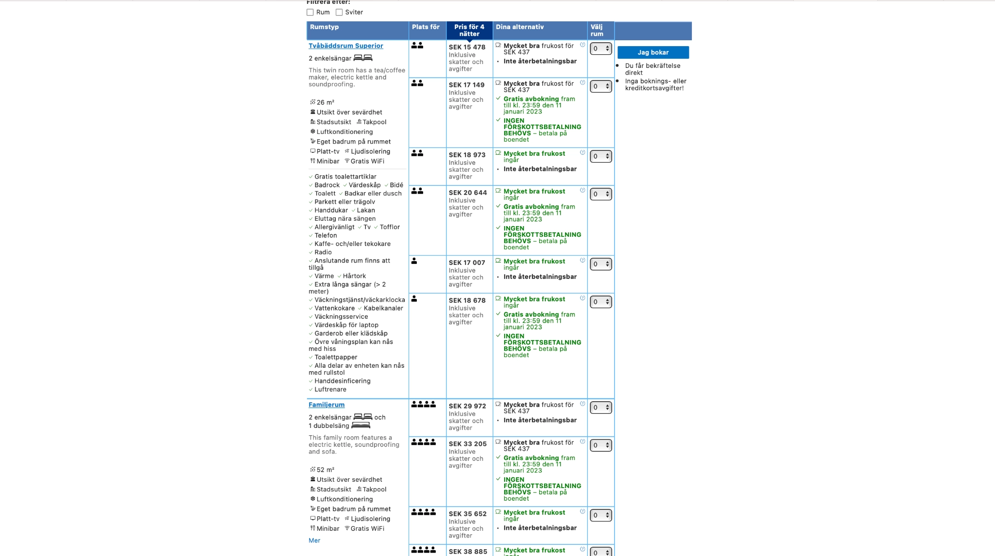
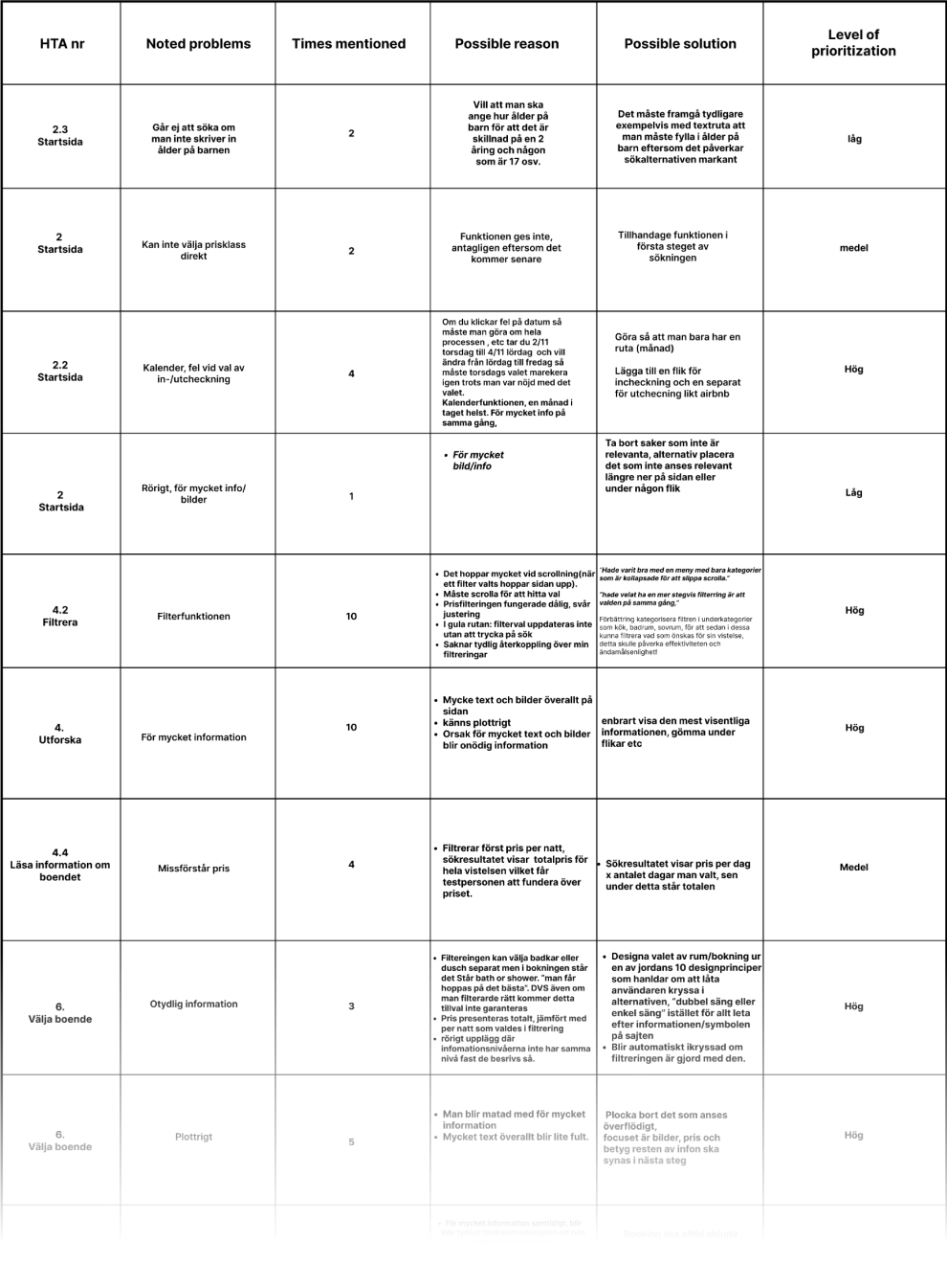
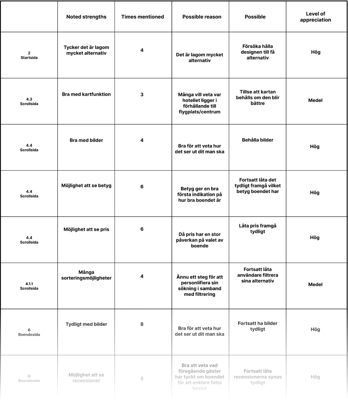
The data from user test 1 was compiled and then extracted to create a list of negatives and a list of positives were the data was carefully categorized to create a well structured source of information to use as a base for the redesign.

Flaws

Strengths

Redesign

Ideation

Each page of the redesign was ideated on by looking at other existing websites that had solved similar issues that we faced. Fast wireframing of ideas was also created.

Wireframing

Elements from the ideation was transferred into a template for the redesign to establish the structure of the different pages and get an early indication of the usability of the redesign.

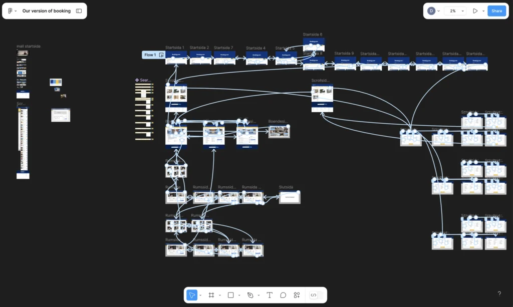
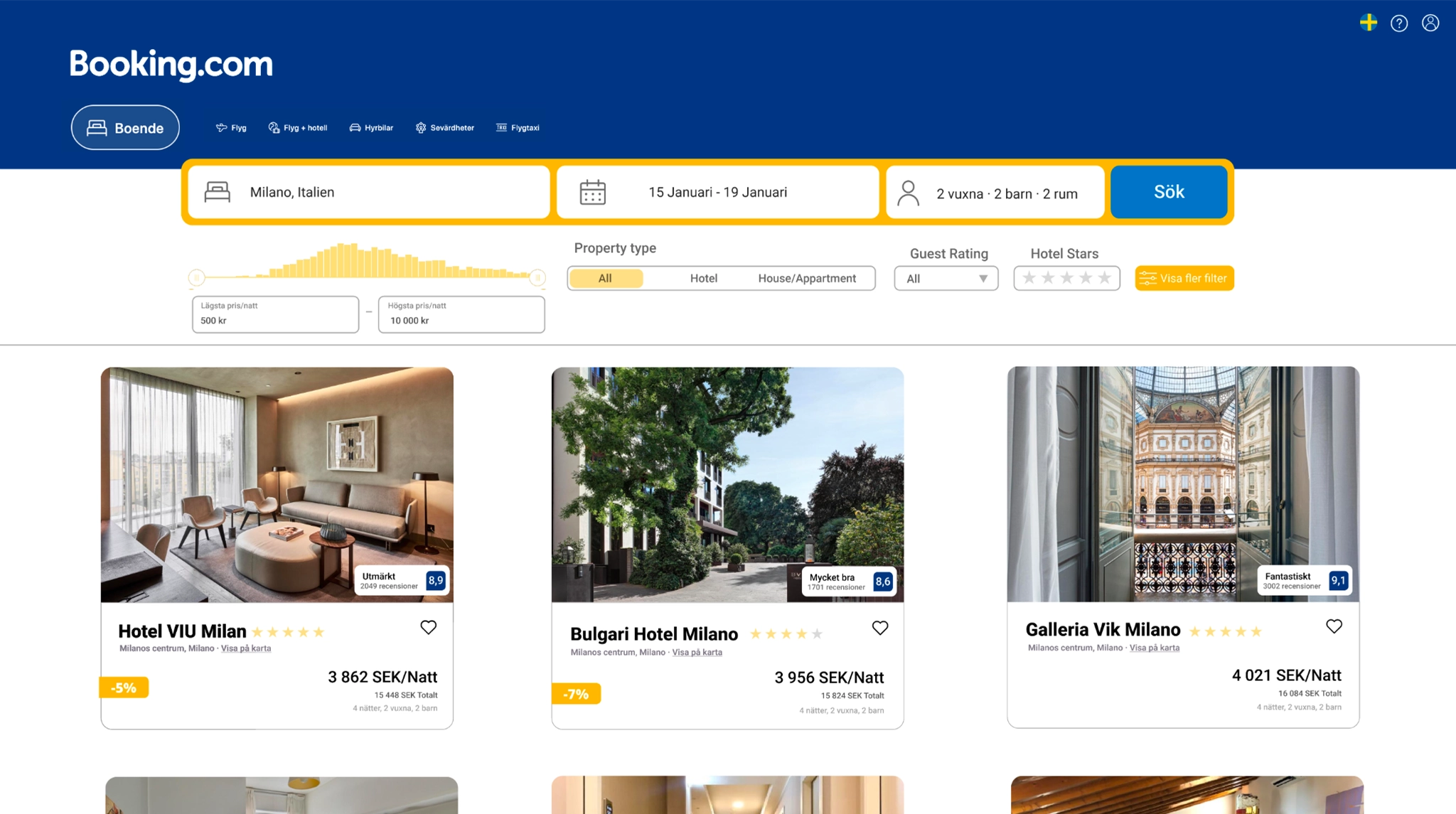
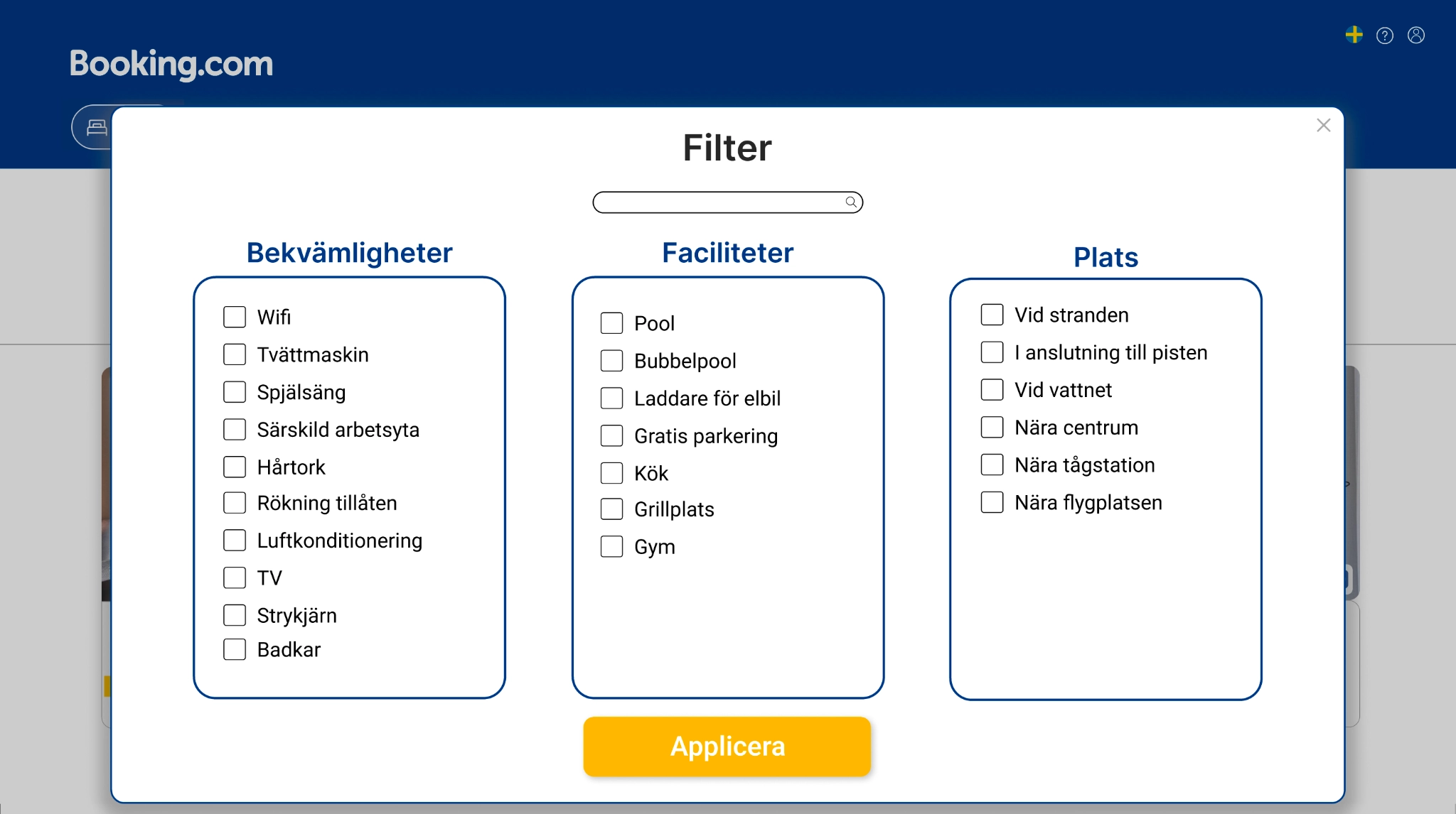
High Fidelity Prototype

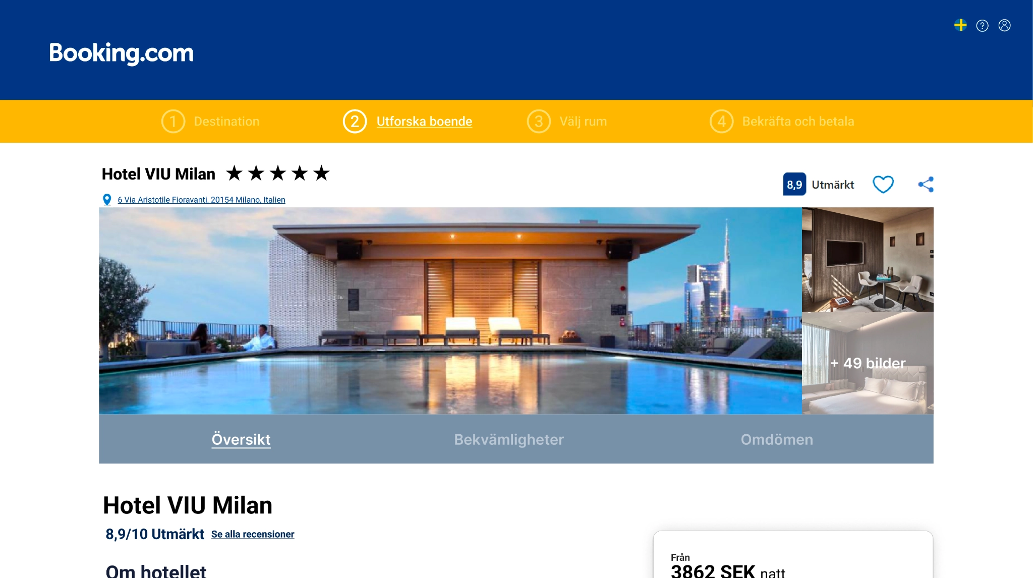
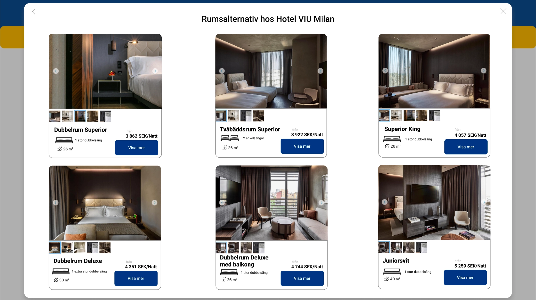
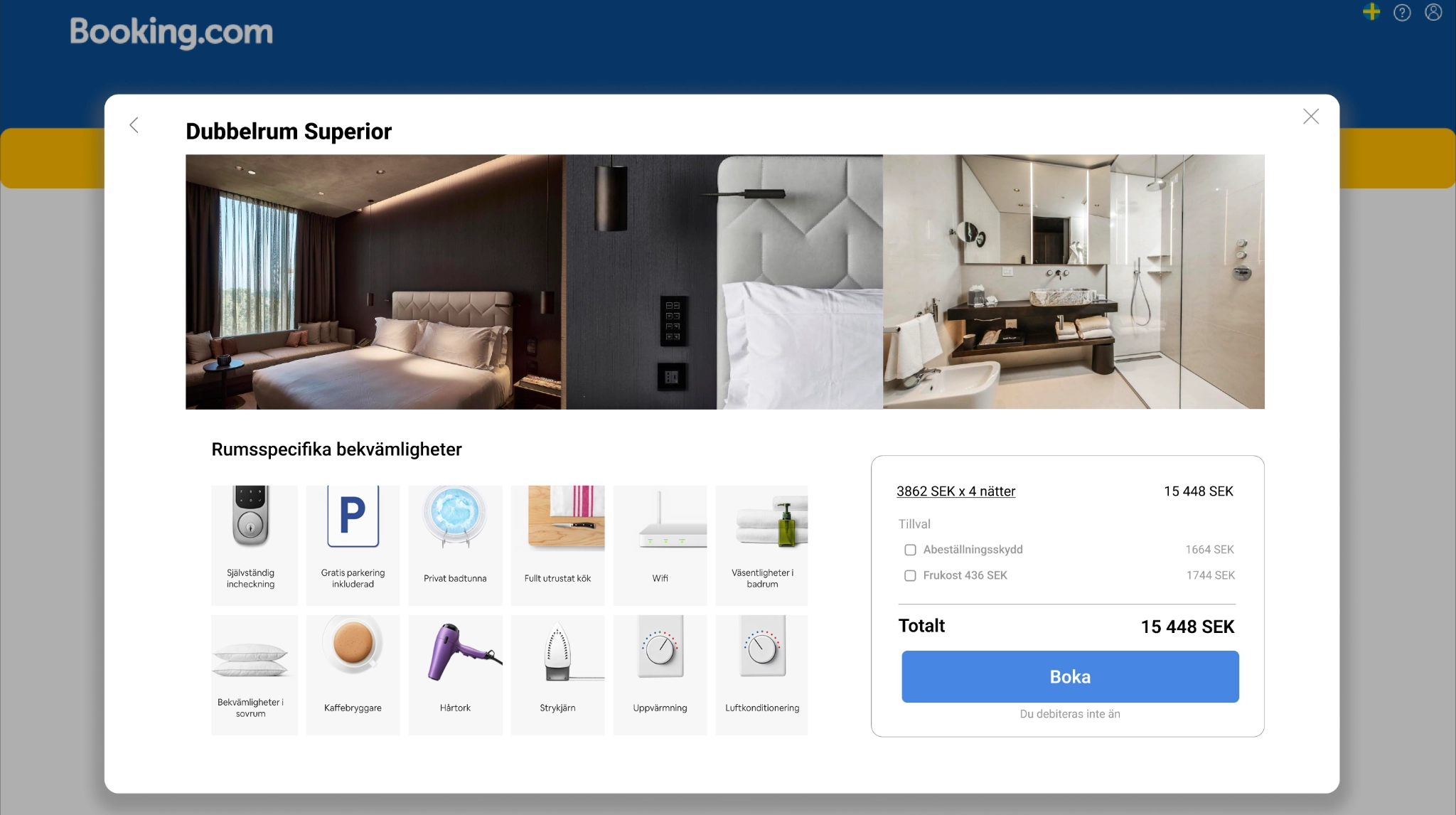
The final step of the design process consisted of making the wireframe into a high fidelity prototype. This step focused on designing the elements that would improve the overall user experience of the website while still maintaining booking.com’s design guidelines.

Evaluating Redesign

High Fidelity Prototype

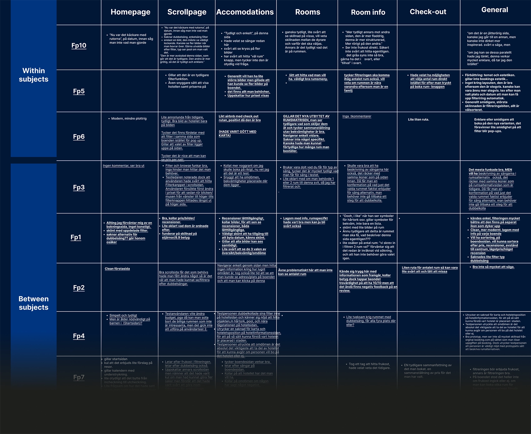
For the redesign the same tests and evaluations as in user test 1 were conducted with both new and returning test subjects to achieve tests with both within-subjects and between-subjects. Some test subjects were also asked to compare the old with the new website design.

Results

The evaluation gave indications of major improvements in usability and overall all user experience. The subjects were pleased with the less cluttered interface with a more intuitive user journey.

This was not only present during the user testing but also clear form the semantic scale comparison between the two designs.

Further Improvements

It is important to mention that the prototype did not have as high fidelity as booking.com’s current website which could have affected the result somewhat. The prototype was also tailored to perform the specific tasks that were asked during the testing. Therefore increasing the fidelity of the redesign would be of great importance to conclude that it is the best performing design.

View final design comparison

View Figma prototype